Wednesday, July 31, 2013

Swatch and Review of A England: St. George

So sorry I haven't posted in a while, I've certainly missed it! I have another longer comparison post in the works right now, so that is what I've been up to. Right now, I have something I am very excited about. This has got to be my favorite nail polish of all time! That is saying something. I don't know if I could actually pick an all time favorite, but this is currently at the top of the list. A England is a brand I have never seen in stores, it is a smaller England based company. I'm not sure on all the details about the company, but I do know that I am already head over heels in love with the brand. The first swatches I saw online were of St. George. I have never seen anything quite like it. Of course, there are many similar colors, but none quite as amazing and stunning. St. George is an emerald green polish with tons of tiny holographic glitters. The glitter is very fine, so it isn't like a typical glitter, it reminds me more of a foil. Without further adieu:

 
Macro bottle shot


Direct sunlight

I only wish I could do this polish justice in these photos. I love it so much I can't bear to take it off! I have wanted St George for so long, I am so thrilled that I have it now. It took me a bit of searching to track this amazing polish. Since it isn't sold in stores I searched on their website for US distributors. Yes, I was that intent on finding it.  I bought mine from Llarowe, which offers a great deal on shipping. The polish was $10 and shipping was $2.07, not a bad deal. Usually shipping makes buying nail polish cost prohibitive. Llarowe is a great site to find indie brands, and if A England is considered and indie brand, this is my first indie polish! 

Once I got this polish in my hands, I knew I was going to love it. All photos above are one coat! I have no idea how they got all that beautiful, rich color and holo in there with one coat. It is amazing. The formula was flawless, I have absolutely no complaints about this polish. It really is stunning. I need more A England in my life, that is for sure. Check out the brand and you'll be hooked too. The only miniscule downfall to this polish is that it comes in a smaller quantity of .39 fl oz, but when you only have to use one coat, it makes up the difference. I can't say I love this enough. Love. Seriously, buy it. Thanks for reading!

Friday, July 26, 2013

Battle Royale: Cheap Matte Top Coat Comparison

Battle Royale will be my title for any post that is a comparison. I like how epic it sounds! This time around it is a battle of cheap matte top coats! I don't know how you all feel about matte finish polish, but I've noticed a lot of people are on the fence about it. A while ago I wanted to try out a nail design that required a matte top coat. The problem was that I didn't want to spend $8 or more on a polish I wasn't sure I would love. Turns out there are cheap ones on the market! I first found Sinful Colors Matte Finish Top Coat for $1.99 at Rite Aid. More recently I found NYC Matte Me Crazy Top Coat for the same price, $1.99 also from Rite Aid. The only major differences that you can see from the bottles are that Sinful Colors has .5 fl oz whereas NYC has .33 fl oz and SC clearly has a different color tone. Unfortunately neither are fast drying top coats, but in researching it seems there aren't any fast drying matte top coats. I recycled my half moon manicure so I could show you a comparison over colors. Here are the contenders:

The color difference here is color accurate.

The NYC Matte Me Crazy has a flattened but narrow brush, which makes application a breeze. The Sinful Colors Matte Finish has the usual Sinful Colors brush which is thick and rounded.

I staggered the different matte top coats, hoping I could see the difference more clearly. Honestly, I don't see much of a difference. All of my nails feel the same, and they seem to have the same level matte finish. However, I did notice an ever so slight color difference between the two. Can you see it? I think the SC makes the color look slightly lighter.  

Here is another view, can you see the difference?

The difference aesthetically isn't enough for me to fret over. The application difference is something that can help determine which to buy. I found that the Sinful Colors took a long time to dry and had a tendency to apply thick. NYC seemed pretty quick drying and was a great consistency: thin but not runny. I like the flat brush that the NYC polish came with instead of the Sinful Colors brush. Overall, I would say that the NYC Matte Me Crazy is the winner here, though I wish it came with .5 fl oz instead of the .33 fl oz. Would you all like to see matte designs that inspired me in my next post? I hope that you will at least try out the matte trend! For $2, it's not a bad deal! Thanks for reading!

Tuesday, July 23, 2013

Tutorial: Half Moon Nail Art

 
Tutorial time! What do you think about a tutorial every month? I actually kind of like doing these pictorial tutorials. Let me know if you like them too! As requested by a friend, I have a half moon manicure to share today! I think there are tons of half moon manicure tutorials, but this is mine. I think with this one patience is the key. These are the polishes I used:

Left to right: Orly Bonder, Color Club Antiquated, OPI Can't Find My Czechbook, Seche Vite Top Coat.


1. Make sure you start with a good base coat. Here I used Orly Bonder. I usually use OPI Nail Envy, but I wanted to try Bonder out. It creates a rubberized base coat and makes the polish adhere to the nail better. After that, add a base color of your choice. I like to use metallic colors.
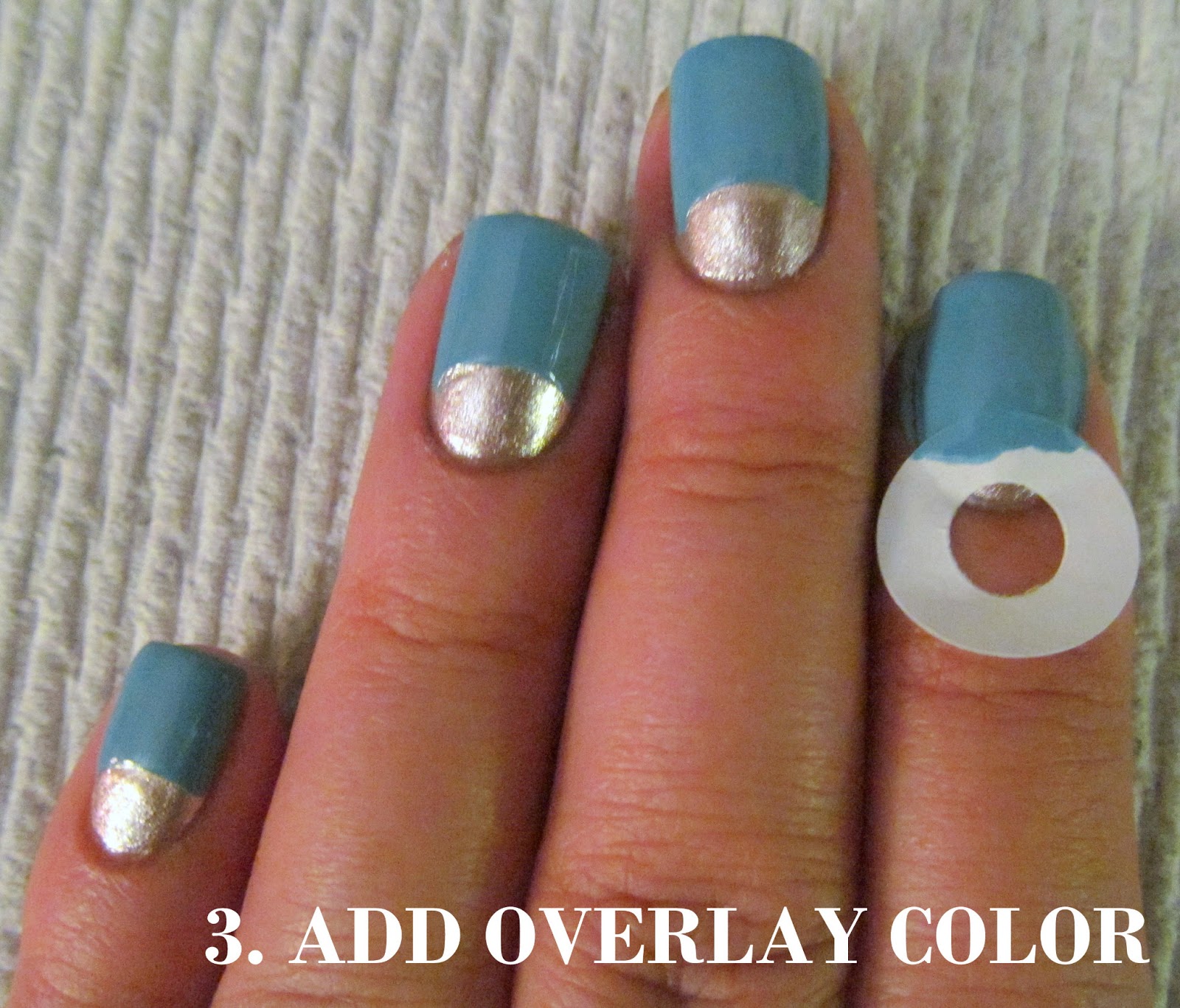
2. Here is where patience is a virtue. Make sure your first layer of polish is dry! Add a reinforcement sticker as a guide. These are so cheap and easy to find. I got mine at the Dollar Store. You can use any kind of sticker with a rounded edge.
3. Apply your overlay color. You can choose any color you like!
4. Very carefully peel off the sticker. You want to make sure it doesn't lift the first layer of polish. Add a top coat and you're done!

Here are some photos outdoors in direct sunlight:


 This color combination makes me happy. I think I just gravitate toward teals and blues, so this shade is definitely my cup of tea! Let me know if you try this out! I would love to see it. Thanks for reading!

Sunday, July 21, 2013

Nail Art: Flower Chevron Tips

Chevron tips!! I can't get enough! Chevrons are so easy and fun. It is pretty much instant gratification. Since the design is so simple, I decided to complicate it a little. I created a multilayer chevron tip manicure. As a base, I started with OPI Bubble Bath which is a pretty sheer nude. It just smooths and creates a nice layer to start with. On top of that I have OPI Can't Find My Czechbook. It is a nice aqua infused sky blue. I added a layer of black as a base for a floral design. I used Wet 'n Wild Black Creme. The flower design didn't turn out as awesome as I envisioned, so I added another layer of black to bring it all together. Photos are outdoors in the shade:


In direct sunlight:


I wanted to do these nails for a contest on Instagram (@HandtasticIntentions). I saw the contest and wanted to enter, but mostly just wanted to try out this design. I think it is pretty fun and I enjoyed doing it. Hope you like it! Thanks for reading!!

Thursday, July 18, 2013

Nail Art: Neon Summer Nail Gradient

Hello friends! Last night some of my co-worker friends and I got together for a nail polish party! Don't you just love having girl time with your friends? We've started doing a nail polish night about once a month and it is pretty stress relieving, I highly recommend it! I decided I wanted to do something a little crazy and bright, so I used some neon colors! I used four different colors from Color Club and created a gradient! I started with a white base color (Sally Hansen White On) then added a few layers of my gradient. I added Essie Pure Pearlfection from the Luxeffects collection as a shimmer coat, then some polka dots! It took a while, but I love how it turned out. It looks like a somewhat Rastafarian inspired look. All photos below are taken outdoors in natural lighting.


The colors are as follows: pink- Warhol; orange- Wham! Pow!; yellow- Almost Famous; green- Feelin' Groovy.

Everything except for the green is from the Color Club Poptastic Collection. Not sure which collection the green is from, but I got it for $1.25 on clearance from Rite Aid. I didn't even know that Rite Aid sold Color Club. This summer looks feels really great and bright! I don't know if I have ever had such a bright look on my nails, but it is kind of amazing! Hope you enjoy!

Related Posts