Friday, August 30, 2013

Nail Art: Blue Flowery Wisps

I've been wanting to get better at using my nail art brushes so I decided to try something new, but not too complicated. I decided to try a flower-like design which looks very wispy and feminine. It reminds me of dahlias, which were the flowers we had at my wedding! All I did was create slightly curved lines from the same starting point on my nail. These aren't perfect, but I'm practicing, so bear with me!


These also remind me somewhat of fireworks! What do you think? These were pretty fun to make. I used four different colors of blue and layered dark colors over the light colors with a metallic blue on top.

My biggest mishap in this manicure was the white base. I used NYC's French White, but it was the first time it failed me. I think that maybe after a little while the formula just gets tacky. It bubbled like crazy! I think from now on I will stick with Sally Hansen for my white bases. Do you have a white polish you really like? I think I might post a white polish comparison soon. Let me know what you think and any particular polishes you think I should compare!

Thursday, August 29, 2013

Swatch and Review of OPI: Vant to Bite My Neck?

OPI Vant to Bite My Neck? comes from their 2013 Spring Euro Centrale Collection. It has been one of my favorite collections. I studied abroad in Central Europe, so for some reason I feel a weird connection to this line of polish. That is probably my way of justifying buying multiple polishes from this collection! Vant to Bite My Neck? is a very vampy, dark purple creme polish with amazing coverage and a beautiful, deep color. I would call it an aubergine leaning black in certain light. See for yourself:


In these photos I only had to use one coat! One amazingly creamy and perfect coat. I really didn't even need a top coat, but of course I always apply Seche Vite. I can't believe I didn't buy this polish when it first came out. I have gotten so many compliments on the color! It is a very dark purple creme, and like I said earlier, in some lights it looks almost black. You can always tell it it purple though! I love dark colors, but I hate when you wear a dark color and people always mistake it for black. When that happens I always want to make them look closely and teach them the nuances of polish colors. Maybe that's just me. Anyway, this polish is to die for! Great quality all around and can be found in stores that carry OPI. I suggest you check out the rest of the Euro Centrale Collection, I highly recommend it. I should definitely get some more swatches from this collection up asap! Thanks for reading!

Wednesday, August 28, 2013

Swatch and Review of Stardust Polish: North of the Wall

I can now say I am the proud owner of three independent label nail polishes, or "indie" polishes for short. I've been curious about indie polish for a while. Some are just amateur looking, but some just blow me away. So stunning, unique and eye catching, some I cannot stop thinking about! This was one of them. Today I have Stardust Polish: North of the Wall. This comes from the Game of Thrones Collection. I've been reading the books and when I heard there was a Game of Thrones collection, it caught my attention. As soon as I saw swatches, I knew I had to have it. North of the Wall is a creamy, milky grey with so many different glitters!


Close up of the polish in the bottle!


Drema, the owner of Stardust Polish, suggests on her description of the polish that the polish looks best with three coats or two coats over grey, white or silver. I wanted to test it out first and see which one I liked best. Here are all four combinations:


Although, I like every version of this, I decided I liked it best over grey. I painted two layers of L'Oreal Greycian Goddess which is a blue hued grey, then added two coats of North of the Wall. Here is the result:


I love North of the Wall, the formula is wonderful to work with! I really love this unique combo of polish! The glitter doesn't make your nail feel rough or anything, but I always use a top coat. It applied smoothly and it wasn't difficult to get the glitters on the nail. I love the combination of color! One of the fun things about themed collections, is trying to gauge how much you think the colors represent the theme. I've only read two of the books, but North of the Wall seems to be very representative of what I imagine it to look north of the wall. Have you watched the series? How well do you think it represents the theme? Stardust Polish always has a hard time keeping this polish stocked because it is in high demand! I had to wait a few rounds of re-stocks to get my hands on this beauty. You can find it here, and I believe she is restocking tomorrow! Definitely check out other colors from the collection! I've got my eye on He Always Pays His Debts! I believe Winter is Coming is going to be discontinued after tomorrow's restock, so if you like it, order it as soon as it is available. I am definitely a fan of Stardust Polish after trying just this one. I love the idea of buying from a small business, especially when the colors are so unique! I hope you check out Stardust Polish!

Monday, August 26, 2013

Nail Art: Blue Chevron Tips

I've done chevron nail designs a lot lately and I just can't get enough! So, here I have another. This one is different because I did it free hand. It is actually easier to do free hand than I thought it would be. I decided to do just the tips this time to create sort of a new take on a french manicure. I can't help but love blue nail polishes!


For this manicure I started with a base of Color Club Chelsea Girl from the Poptastic Collection. For the metallic edging I used Color Club Cold Metal from the Foiled Collection. I used Sally Hansen Blue Me Away! for the tips. Love the way this turned out! It kind of reminds me of the ocean, but maybe it is just because of the color. Have any of you tried any chevron designs lately? Hope you like it!

Wednesday, August 21, 2013

Nail Art: Galaxy Nails

Ever since my nail polish obsession started all of maybe a year ago, I have been wanting to try this amazing look on my nails. Something called galaxy nails at first sounded a little hokey to me, but once I saw photos of these galaxy nails I knew I had to try it! Your nails basically turn into a vortex into the galaxy. No matter how unskilled you think you may be, you can do this and your nails will be stellar! I couldn't keep from adding a pun! Anyway, this is a simple (I really mean it this time) look to achieve with professional looking results.

Direct Sunlight

Direct Sunlight

 Direct Sunlight

Shade

I started with a black base, let that dry and sponge on a deep blue, a lighter blue and a purple or pink. The result is a bunch of color blobs on your fingers, but the key here is when you add the glitter coat. Suddenly the glitter coat adds the stars and it transforms your nails. I also added a top coat. The colors I used are as follows:
Base- Orly Bonder
Black- Wet n Wild: Black Creme
Deep Blue- Essie: Aruba Blue
Light Blue- China Glaze: Sea Spray
Purple- OPI: Suzi and the 7 Dusseldorfs
Glitter- OPI: Pirouette My Whistle
Top Coat- Seche Vite, always
So fun! The only tricky part is getting the right glitter. I have one that has a good mix of big and small glitters. You definitely want both kinds to have the effect of both close and far away stars. I've even seen some where people take a white striping brush and paint on stars. The great part is that this design is so easily adaptable! I didn't create this design and there are many tutorials out there, but after seeing so many amazing versions I wanted to try one for myself. I hope you like it!

Monday, August 19, 2013

Swatch and Review of butter LONDON: Two Fingered Salute

I love butter LONDON, and when Nordstrom recently had a buy two get one free sale, I had to give in. I picked up a really unique color, Two Fingered Salute. I think it is actually a Nordstrom Exclusive.  I would call it s greyed out green with bronze and pink flecks of glitter. It is so different from anything else in my collection, I had to take it home! It is a nice change of pace to find something that is so very different! Check out the photos below, all are outdoors.


Like other butter LONDON polishes I have, the first coat applies a little patchy. Fortunately, the second coat applies like a dream! I think that is what has me coming back. The formula is always great at self leveling and always has taken two coats total. I don't have a large collection of butter LONDON, but I do love the brand. I have nothing bad to say about this polish, it is so lovely! Unfortunately, butter LONDON is a bit more expensive than other brands. It runs $15 a bottle and is very rarely on sale, but when it is, it feels so indulgent to get some. Soon, I'll be sharing the other colors I got! Hope you like Two Fingered Salute!

Thursday, August 15, 2013

Nail Art: Pastel Summer Neon Gradient

Today, I have something special to share. I love nail art gradients and ombré designs! I decided to create a very summery look with only two colors, and I think it turned out great. I used the sponge gradient technique, which is pretty easy and very rewarding. I also tried at home gel nails. I'm not sure I've quite mastered it since this is my second time, but I think I am getting the hang of it.All photos taken outdoors in indirect sunlight.


I am so in love with this design!! I used Birchbox exclusive colors from Color Club. These came in a mini set that I bought after receiving one of the colors in my monthly Birchbox. I've mentioned Birchbox before, but it is a monthly beauty product subscription service. So far, I like it a lot. For a base color I used Mod in Manhattan which is an off white and the two main colors are Pardon My French and Reign in Spain. I didn't know it was possible to have pastel and neon in the same polish, but it is possible, and it is gorgeous! The sponge technique is really easy, maybe that can be this month's tutorial? I had to dab about three layers over Mod in Manhattan, but I'm not sure I would have done three layers if I was just painting them like normal. I love this so much, I don't know if I will want to to take it off! I hope you like them. Thanks for reading!

Tuesday, August 13, 2013

Nail Art: Monochromatic Stamping

Today I have an updated mani to share! I added to Sinful Colors: Skylark and I think the effect is interesting. I added a matte top coat to my nails, let it dry and stamped a leopard print in the same color on top. I used Konad M57 seen in this post. It is pretty easy!


Really the key to getting this to work is making sure that the matte top coat is completely dry and making sure that you use a thick polish for stamping. I've had a couple questions about stamping lately, are you all interested in a tutorial? I don't use any special polishes, but I stamp fairly often. I think this look is a great way to do subtle prints on your nails without looking too wild. Pretty sweet! Let me know how you like this, and if you want to see more designs using matte polish. Thanks for reading!

Sunday, August 11, 2013

Swatch and Review of Sinful Colors: Skylark and Song of Summer

Recently I picked up some nail polish at Walgreens on sale. I got 1,000 points for buying two Sinful Colors polishes and they cost me $0.99 each! There was a new display on the end cap, and I found two lovely shades. Skylark is a bright orange yellow leaning color and Song of Summer is a light mid-tone green. I can't really tell if Song of Summer leans more yellow or blue. Here is Skylark:

 Outdoors

 Outdoors in shade


I applied two coats of Skylark. The formula was consistent with what I have grown accustomed to from Sinful Colors. The polish is fairly runny but can get a little gummy. This color is pretty bright but great for summer. It reminds me of an Illamasqua shade called Purity. I don't own it, so I'm not sure if this is a dupe for it or not, but it could be. I have been wanting to get Purity for a while now, so this could satiate that! Now let's get to Song of Summer:


Song of Summer was great! I applied one very careful coat. I could have done two, but I wanted to see if one would work. It covers well, but it can get patchy. This one has great coverage and a beautiful green color. It isn't too bright or too showy which is great if you like to wear brighter colors to work.

Overall I think these are both a great deal. I love these colors and for the price, you really can't beat it. If you are looking for some good summer colors, these would be great in any collection. Thanks for reading!

Thursday, August 8, 2013

Swatch and Review of Sephora by OPI: Henna-thing Is Possible

Today I have Sephora by OPI: Henna-thing Is Possible!  Currently, Sephora just further reduced the Sephora by OPI polish!! Now you can get it on sale 3 for $10. Go get that! I bought mine when it was 50%, so I got Henna-thing Is Possible for $4.50. SOPI always seems to have a great formula and some unique colors. Henna-thing Is Possible is from the Indian Summer Collection 2012.


Direct Sunlight

Direct Sunlight

Macro Shot of the Bottle

This is a bright color for summer! I love how in some light is looks pink or fuchsia and is some it looks purple. It definitely has some blue leaning glitter micro-flecks. I applied two coats of this polish and it covered really well. It had a thinner formula than I am used to, but it evens out great in the second layer. This is one of those polishes that you are happy to apply because it is to wonderful and smooth. I actually wore this color much longer than I usually do and I had no staining. Colors similar to this have left stains on my nails, but this is stain free which is always a plus. Like I said, Sephora by OPI is one sale now for the same price as Sally Hansen polishes, so go get some girl!

Saturday, August 3, 2013

Battle Royale: Drugstore Duochrome Metalic Polishes

Today's battle royale features some drugstore duochrome polishes! A while ago Revlon came out with a line called Chroma Chameleon and Sally Hansen came out with Lustre Shine. Recently, I found some of these duochrome polishes on sale, so I thought I would try them out. I really can't resist a sale on nail polish! I picked up two Chroma Chameleon polishes from Walgreens for $3.99 and the Lustre Shine polish from Rite Aid. I got one a while ago for full price, and one more recently for 40% off which made it around $4.50 or so. I can't remember the exact price. Regardless, I got these for a pretty good price and I couldn't resist sharing:


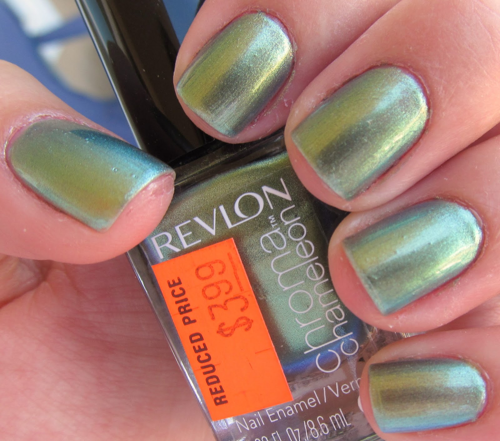
Revlon Chroma Chameleon Topaz. This one took three coats, but probably would have been fine with two. I just felt the need to add and extra layer. It is a nice green/gold/aqua polish. The shift from the three colors is really more prevalent in person, but it was very distinct. I felt like one of those shiny color changing beetles. That is kind of a creepy analogy, but trust me when I say it was a good thing. Really enjoyed this one.


In direct sunlight


Revlon Chroma Chameleon Cobalt. This one didn't really have a strong color shift. If I had to say what the other color besides blue was, I would say purple. It isn't a strong shift by any means, but it is still a gorgeous and vibrant color. Really is a true cobalt color. If you are looking for a blue duochrome, this isn't your polish. If you are looking for a gorgeous blue, this is a great contender. Photos below were two coats. 


Sally Hansen Lustre Shine Copperhead. Don't mind the shrinkage on the tips of my nails. I didn't carefully apply my Seche Vite. I applied two very wonderfully pigmented coats. The Sally Hansen brushes are shaped and flat, which make application nice and easy. Of the bunch, Copperhead had the biggest and most prominent color shift. It is hard to capture in photo, but it went from a metallic brown/bronze color to a burgundy. It is really beautiful! It has a nice warm feeling to it.

In direct sunlight


Sally Hansen Lustre Shine Firefly. I also applied two pigmented coats here. This one was an interesting shift from pink to gold to a hint of green. I'm not sure if that is really what a firefly looks like, but I'll take it. This one seems the most girly of the group.


I would say the winner of this group is Revlon Chroma Chameleon Topaz! I just thought that it was the best mix of easy application, color shift and value. I enjoyed all of these polishes but I did notice the Sally Hansen polishes were more prone to bubble. I think all of these are a great value, but some didn't really have as strong of a duochrome effect that you would expect from a polish labeled as such. I hope you enjoyed this post and try some of these polishes!

Related Posts