Wet n Wild's Spring 2016 collection is out now, so I decided to get all of them and sharing them with you today! The collection includes a soft pink called Love Fest, a blue mint called Kiss My Mints, a lavender called Lay Out in Lavender, and a periwinkle blue called Breeze on By. All of these are soft and light shades typical of what you would see in spring.
Showing posts with label spring. Show all posts
Showing posts with label spring. Show all posts
Sunday, April 3, 2016
Friday, March 25, 2016
KBShimmer Spring 2016 and Mega Flame Collection (Partial)
Press Sample
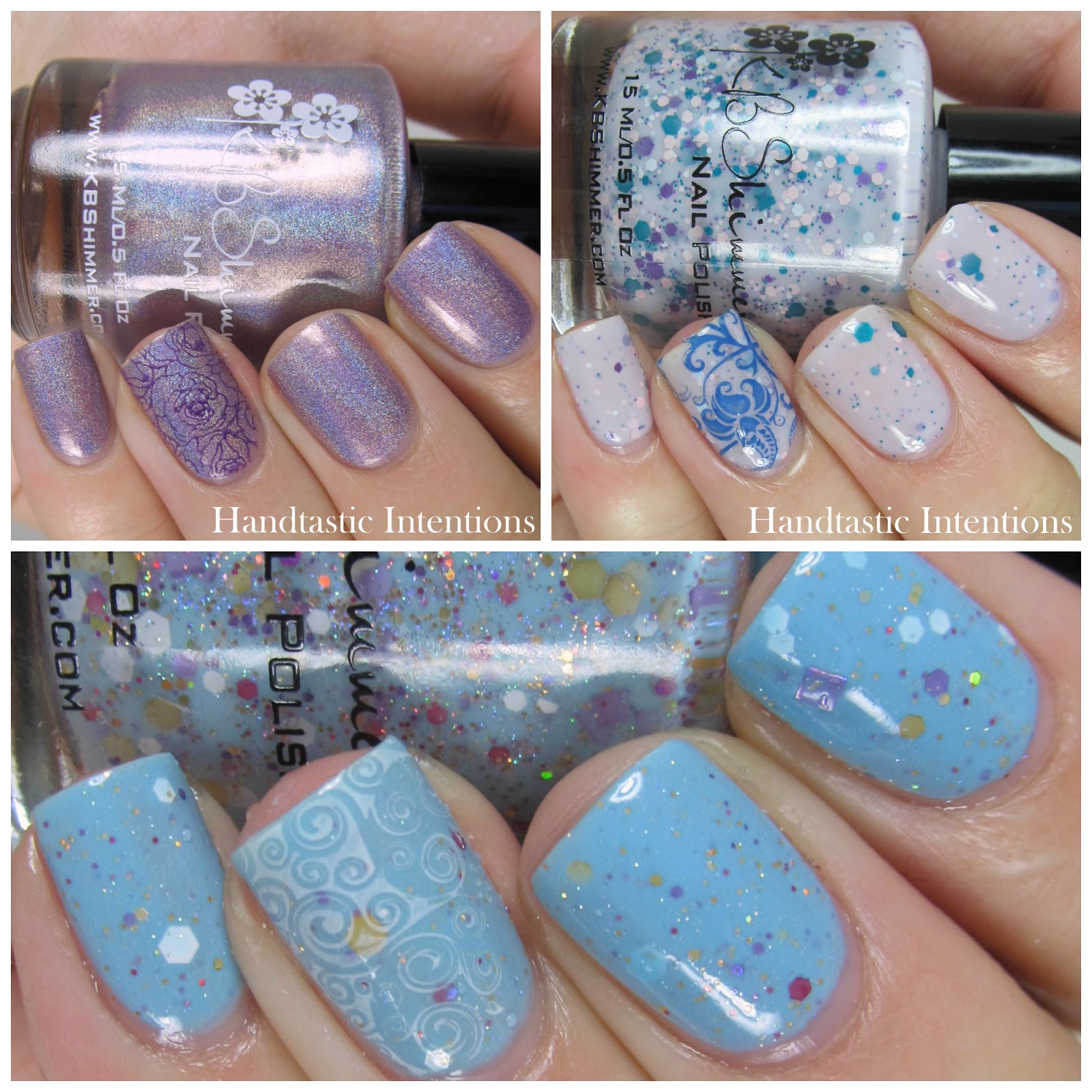
I have two colors from each of the new collections from KBShimmer called the Spring 2016 and the Mega Flame Collection. I have Peony Pincher from the Spring 2016 Collection and Stalk Market from the Mega Flame Collection. Peony Pincher is described as a pastel pink with lavender undertones and is a linear holographic. Stalk Market is described as a near celery green yellow. All the Mega Flame polishes have some strong holographic glitter.
Labels:
KBShimmer,
Mega Flame,
Provided for Review,
Reviews,
spring,
Swatches
Sunday, April 12, 2015
Nail Art Spring Gradient
The nails I have to share with you have been sitting in my to blog file since before Easter! I created a springy gradient with three colors from a mini set of Nails Inc polishes. I used Sloane Street, Princess Gate, and Bruton Lane.
Labels:
Bruton Lane,
Gradient,
Nail art,
Nails Inc.,
Princess Gate,
Sloane Street,
spring
Sunday, March 1, 2015
KBShimmer Spring 2015 Collection (Partial)
Press Sample
KBShimmer is back on the blog with three from the new Spring 2015 Collection! I have Thistle Be The Day, I'm So Sweet Pea, and Wind Swarm. These are so pretty and perfect for the spring season, I can't wait to share them with you! Two are glitter jellies and one is a linear holographic creme!
Labels:
KBShimmer,
Nail Stamping,
Provided for Review,
Reviews,
spring,
Swatches
Friday, June 27, 2014
Nail Art: Spring Inspired Water Marble
I'm so happy, I finally got water marbling to work again!! Water marbling is a struggle for me. It is probably because I refuse to buy bottled water just to water marble, so really it is my own fault. However, I got two OPIs to water marble nicely in Brita filtered tap water. Winning! I used Gargantuan Green Grape and Can't Find My Czechbook to create a sort of spring inspired look. I started with a white base on the fingers I was going to marble and the other nails have two coats of GGG and dots of CFMC. Sorry the names are long, so I am abbreviating.
Labels:
Blue,
Can't Find My Czechbook,
Gargantuan Green Grape,
Green,
Nail art,
OPI,
spring,
Water Marble
Wednesday, June 4, 2014
Swatch and Review of OPI Moon over Mumbai
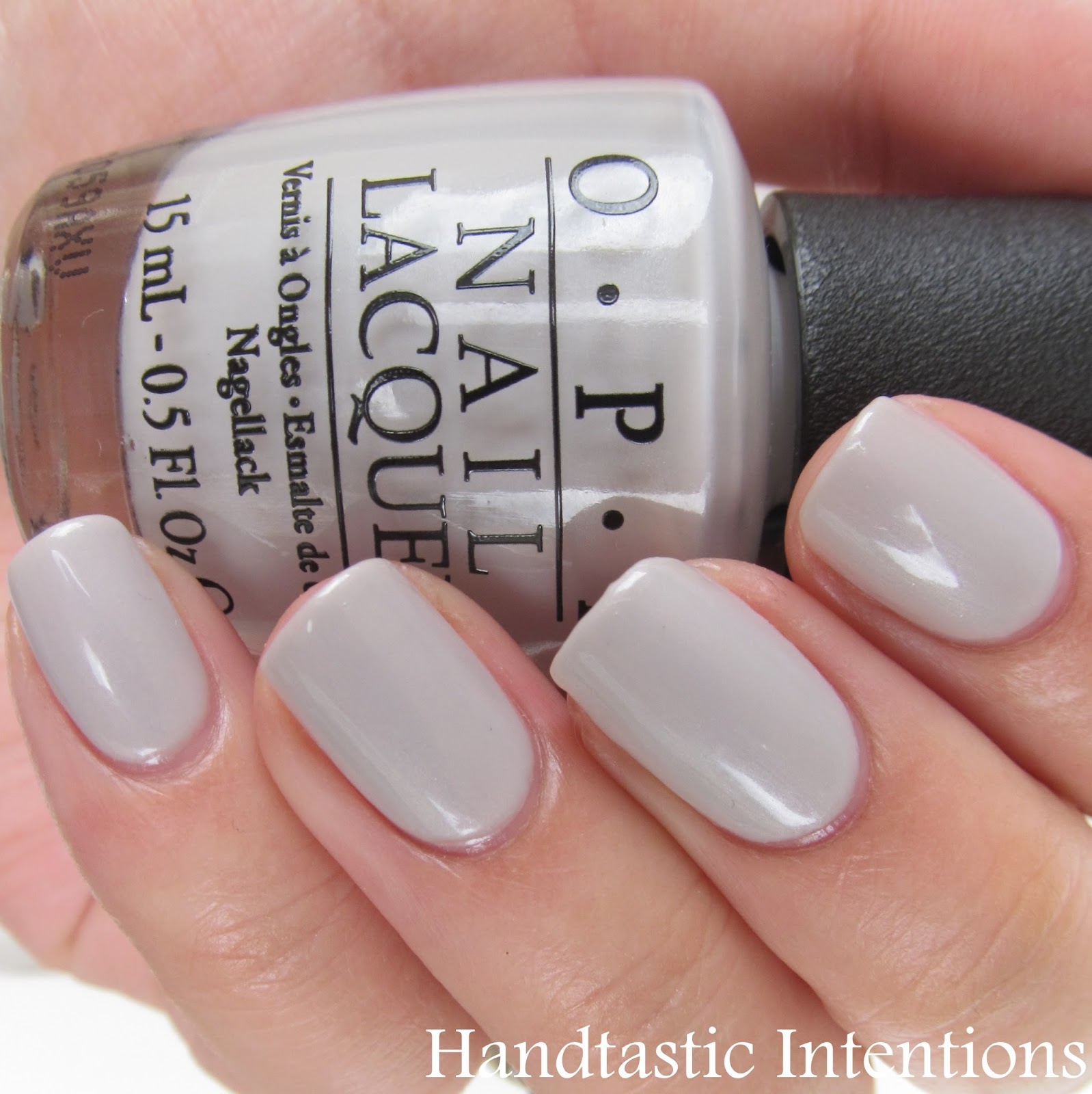
Today I have an older polish, not old to me, but it was released quite a while ago. Today I have OPI Moon Over Mumbai, which is from the 2008 Spring India Collection. I have another from that collection (Black Cherry Chutney) and had seen swatches of this on other blogs, so when I saw it on sale at Ulta, I had to grab it. It is a greyed out white with an iridescent finish. I thought it would be a prefect neutral for work events. I decided to sport these for a business meeting, and I think they worked nicely for that.
Labels:
Grey,
India Collection,
Moon Over Mumbai,
Neutral,
OPI,
spring,
White
Monday, April 7, 2014
Swatch and Review of Orly: Blush Spring Collection
Today I have two polishes from Orly's Blush Collection. This is a neutral color collection, which is one I usually hate. I have such a difficult time with nude colors, and neutral color collections usually include several nudes. This collection, however, has several colors. I picked up an off white with pink shimmer called Naked Canvas and a lavender with gold shimmer called Flawless Flush. First up is Naked Canvas.
Sunday, October 27, 2013
Nail Art: Dotticure with Color Club Kaleidoscope Collection
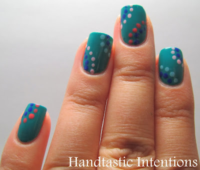
Today I have something that isn't particularly fall themed, but I had the urge to try it out. This design is something I saw on Pinterest, the link doesn't go directly to the design, but you can see it on my board here. I just really liked the simplicity of it. I used different colors but the same idea. I used the Color Club Kaleidoscope collection for this design. I have the set and I used all except the shimmery top coat called Pearlspective.I did use a dotting tool for this, but if you don't have one, you can easily improvise.

I used the darker blue as the center color for each section and alternated colors from there. I used two coats of the base color. I really like this one! I got so excited to do it, I forgot to apply my base coat! I think this is really more of a spring or summer look, but who cares? I love it, and I hope you do too!
Subscribe to:
Posts (Atom)


