Monday, October 14, 2013

Swatch and Review of OPI: Lucerne-Tainly Look Marvelous

OPI came out with a lot of hits with their Fall 2010 Swiss Collection. I reviewed Yodel Me on My Cell a while back, and I still have a few others from the collection on my mind! Today I have Lucerne-Tainly Look Marvelous! This reminds me of a foil but in the bottle, you can clearly see the different specks of glitter. It is a blue leaning grey/silver color which is right up my alley! I love this color so much, I can actually see myself wearing this over and over again. I feel like this would be a great transition color from fall to winter.


Above I used three coats of polish to achieve opacity. Like I said before, I love this color! The formula left a bit to be desired. It had a tendency to be a little tacky even though the polish seemed thin. It took a long time to dry and didn't dry solid for a while longer than I am used to waiting, I'm a little impatient though. The color is definitely worth the hassle of the formula, but if you are one of those who really has a hard time with application, I might be careful with this one. The sparkle is just so lovely! I think I actually picked this one up at Fred Meyers with one of their buy 2 get 1 free deals, but I don't think that always have the same stuff in stock. Ulta should have it though! Retails for $9 per bottle. Thanks for reading!

Wednesday, October 2, 2013

Nail art: Orange Leopard and Chevron Nails

Hello all! I've been thinking about animal print and particularly leopard print a lot lately. I don't usually wear animal print, but I like it. Sometimes I think it is a bit too wild, but I like mixing it with solids. That's kind of what I did here. I decided to create an unnatural leopard print coloring of orange and red and added a deeper red overlay to kind of balance out the print. I did this for #nailartsep on instagram.


I used only the above polishes in this mani from left to right: Soul Mate, Cherry Bomb, Mind's Eye (All Orly). I started with a base of Cherry Bomb and added irregular spots of Soul Mate. Then I added somewhat irregular C shaped around the spots and added some random dots using Mind's Eye. After I let it all dry, I cut up some tape into smaller angled triangles and painted Mind's Eye over that to create the sharpened chevron tip. This manicure made me want to perfect my leopard print painting skills, so look out for a more natural leopard spot on the blog soon! Thanks for reading!

Sunday, September 29, 2013

Swatch and Review of Zoya: Giovanna and Ruffian: Delirium

We have had quite a bit of blustery, stormy weather here in Oregon lately and that makes me want to embrace fall finally. I've been wanting to hold on to summer, but I think now I am ready for the season change. Today I have two lovely fall colors to share with you! I picked up Zoya Giovanna on a whim, because it looked like a nice color that I didn't already own- which is saying something. I'll get to the Ruffian polish further in this post.


Isn't Giovanna stunning? I love how this polish glows. It was a little more teal leaning than it looks in the bottle, but gorgeous nonetheless. I applied three coats to get full opacity. Zoya is a brand that actually is free of 5 harmful chemicals rather than the usual 3, commonly called 3 free. I'm somewhat concerned about harsh chemicals in my nail polish, so when I can, I try to at least get 3 free polishes which most brands are doing now. Let's move on, shall we?

Introducing Ruffian Nail Lacquer:


Ruffian is actually a high fashion brand and this is their first dabble into the polish market. I received this product in my monthly Birchbox, but probably wouldn't have heard of it since it is exclusive to Birchbox right now. Apparently a few years back at one of their runway shows their models sported a new style of manicure which I have mimicked below. and have posted about previously.


The color is called Delirium and I would say it is more of a royal purple and less blue in real life. I love this polish! I only used one coat for the layer over Giovanna. It is so smooth and lovely and with the bottle design, the application is a breeze. Delirium is from their Crowd Sourced collection, which is the more vibrant and daring of the two collections. I have already ordered their Classics collection. I just have to have more! I am really impressed with this new line of polish. It is pricey at $10 for only 0.17 fl oz. That is usually a sample size or mini container size. I really enjoy the ergonomic and interesting design of the brush handle, it makes a difference in ways I never knew I needed a change! What do you think of these two colors? I enjoyed these colors together. It reminds me of peacock colors, which is always rich and fun. Hope you like them too. Happy Sunday!

Saturday, September 28, 2013

Nail Art: Daisies

Summer isn't my favorite season of the year, but I do love it and wasn't quite ready to let it go. This is my last hurrah for summer! The look was inspired by another instagram user: @AMKUCH15, her looks are amazing and she always has perfect nails. She did this design with a sky blue background, which I loved, but I decided to do it over a melon color instead, since that is what I had on. I like to call these, upgraded manicures.


I had planned on doing three flowers on each finger, but I made them too big! I just used a small nail art brush and a dotting tool to create the flowers over butter LONDON Trout Pout. Really simple and cute design. I don't think I made it quite as perfectly as @AMKUCH15, but I think it looks nice. Now, that I got my last summer design out of the way, I think I can fully welcome the fall season!

Wednesday, September 25, 2013

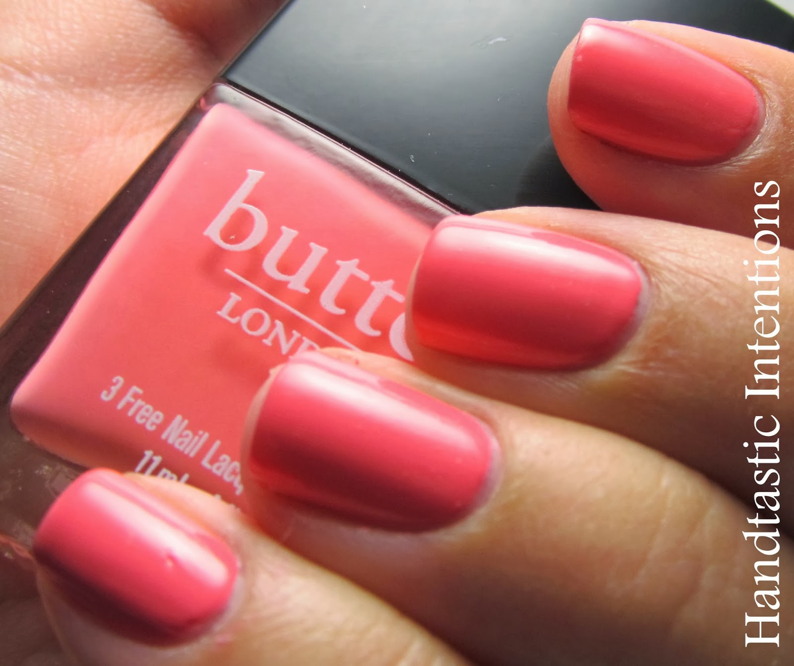
Swatch and Review of butter LONDON: Trout Pout

Trout Pout is a color from butter LONDON that I have been eying for quite some time. It is a pinky coral color with a smooth creamy finish. It is one of those interesting colors that could swat either more pink or more coral. I think I hesitated buying this because I wasn't sure how it would look on my skin tone. Turns out, it looks great! The website claims that it looks great on everyone and describes the color as a cantaloupe. I'm not sure it looks like a cantaloupe color, but I do think this color would look great on all skin types!


In these photos the color does lean a little more pink than it looks in real life. It really depends on the lighting, but I found it to be mostly pink, most of the time, while in some lights it definitely had more of an orangy hue to it. The polish was a little thin, I had to use three coats. It doesn't usually bother me when I have to use three coats, but for some reason I expect butter LONDON to do better since the price is so much more expensive. Great quality polish, there was no tackiness or balding. I just wish I had used this more in the summer! Of course I discover a great summer color just as fall is kicking in. Oh well, such is life. Hope you enjoy this!

Related Posts