So a while ago I created a Neon Tribal Print design with these three Island Girl polishes that I received from a good friend (hi Hollie!). I just realized that I never did a full swatch and review for you! I can't believe I didn't realize this earlier because I love these colors! Unfortunately I don't have names of these polishes, but they come in a set and are sold wherever Island Girl is sold- predominately in Hawaii and Las Vegas as far as I know. I did hear from a reader that they are sold in Guam as well. So, for this post I will call them pink, coral and teal.
Showing posts with label coral. Show all posts
Thursday, August 14, 2014
Tuesday, July 29, 2014
Neon Week Nail Art (and TUTORIAL): Monochrome Arrows
Labels:
Ablaze,
China Glaze,
Color Club,
coral,
Flip Flop Fantasy,
Nail art,
Neon,
Neon Nails,
Neon Week,
Orange,
Orly,
Warhol
Wednesday, September 25, 2013
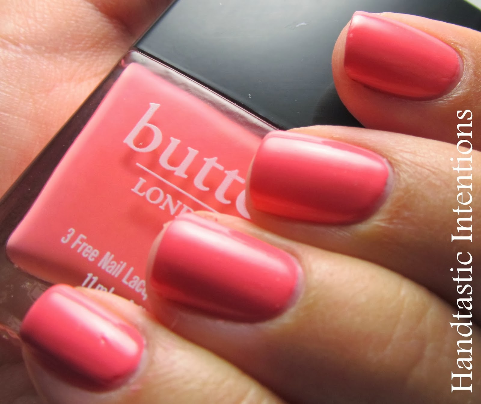
Swatch and Review of butter LONDON: Trout Pout
Trout Pout is a color from butter LONDON that I have been eying for quite some time. It is a pinky coral color with a smooth creamy finish. It is one of those interesting colors that could swat either more pink or more coral. I think I hesitated buying this because I wasn't sure how it would look on my skin tone. Turns out, it looks great! The website claims that it looks great on everyone and describes the color as a cantaloupe. I'm not sure it looks like a cantaloupe color, but I do think this color would look great on all skin types!
In these photos the color does lean a little more pink than it looks in real life. It really depends on the lighting, but I found it to be mostly pink, most of the time, while in some lights it definitely had more of an orangy hue to it. The polish was a little thin, I had to use three coats. It doesn't usually bother me when I have to use three coats, but for some reason I expect butter LONDON to do better since the price is so much more expensive. Great quality polish, there was no tackiness or balding. I just wish I had used this more in the summer! Of course I discover a great summer color just as fall is kicking in. Oh well, such is life. Hope you enjoy this!
Labels:
butter LONDON,
coral,
Pink,
Reviews,
Swatches
Subscribe to:
Posts (Atom)