Wednesday, October 30, 2013

Nail Art: Halloween Monster Nails

Happy Halloween Readers!! I never was a huge fan of Halloween ever since my mom made me dress up as a fat clown to keep me warm (practical mothers...gotta love them). I of course loved the candy as a kid, but nowadays I really like just relaxing with my husband and picking out scary movies to watch. Maybe watching a scary movie isn't actually relaxing, but it is entertaining! We've been watching American Horror Story on Netflix, which actually seems Halloween themed and scary anyway. I like scary movies, but I don't think I like scary nails.

Today, I have some monster cartoon nails to share with you. Before I saw this next design, I said I was never a fan of characters or cartoon type designs on nails. I am now proven wrong! I saw this Halloween nail tutorial originally on Ipsy, but linked to YouTube. The tutorial is done by I Have A Cupcake and I think it is adorable! I really don't like the look of zombie or bloody nails, but I think this is a cute way to celebrate Halloween without getting too literal on your nails. I just followed the tutorial with some adjustments based on what colors I had in my collection, but I think it turned out pretty similar.


So there is a mummy with blood red crazy eyes, a witch, Dracula, Frankenstein and a ghost. What do you think? Scary? No? Didn't think so, but I like the simplicity of the design and the cute factor of the cartoons. I used mostly regular nail polish, but my black nail striper came in handy here. This is a really fun intro to character nail art. If you check out the video be sure to check out I Have A Cupcake's other designs, she has similar little characters for different occasions. Have a fun and safe Halloween!

Tuesday, October 29, 2013

Nail Art: Matte Charcoal Design

Let me just start with: this idea looked much better in my head. I had a great idea of creating a half moon mani and adding some designs in the half moon area. I did that, but my designs lack prescision and detail. I wanted to share it with you anyway to show you that many times I hit some bumps on the road o better nail art. You cannot get better if you don't try! I was excited to try this design and it didn't seem to quite go the way I had planned, but it still looks interesting. I used Sinful Colors Secret Admirer as the overlay color (charcoal with glitter), I used Color Club On the Rocks (Silver) as the base color and NYC Matte Me Crazy for the top coat. Take a look:


I was going for a Greek inspired look, but this ended up a little sloppy and random. I think my brush was a bit too big, but lesson learned. What do you think about this? I really love the Sinful Colors Secret Admirer, I can't believe it took me so long to use it! I had it sitting in my stash unused for at least a few months. It went on smooth and buttery, a little thick, but similar to most other Sinful Colors I have used. I also really like the matte effect with this design. Hopefully next time I can actually pull off all the detail I hoped to achieve. Until next time, take care!

Monday, October 28, 2013

Nail Art: Blue Vines

I've come to realize in the past few months that the best nail art is done with acrylic paint, rather than nail polish. Acrylic paint is a lot easier to work with and you can thin it down to make it even easier. Today, I was inspired by Kimiko7878 on Instagram who has tons of beautiful nail art designs made with acrylic paint over regular nail polish. I first saw her design here, then promptly decided I needed to try it. Spoiler alert: hers is way better! I wasn't really original here, but perhaps being a little unoriginal for a few days will liven my creativity!


The background color is OPI I have a Herring Problem. This is one of my first really artsy designs with acrylic paint and I actually really enjoyed it. I feel kind of silly using acrylic paint on my nails when I have so much polish, but to make the designs really detailed, acrylic is the way to go! I'm looking forward to trying some more detailed work in the future. Thanks for reading!

Sunday, October 27, 2013

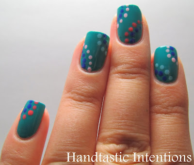
Nail Art: Dotticure with Color Club Kaleidoscope Collection

Today I have something that isn't particularly fall themed, but I had the urge to try it out. This design is something I saw on Pinterest, the link doesn't go directly to the design, but you can see it on my board here. I just really liked the simplicity of it. I used different colors but the same idea. I used the Color Club Kaleidoscope collection for this design. I have the set and I used all except the shimmery top coat called Pearlspective.I did use a dotting tool for this, but if you don't have one, you can easily improvise.


I used the darker blue as the center color for each section and alternated colors from there. I used two coats of the base color. I really like this one! I got so excited to do it, I forgot to apply my base coat!  I think this is really more of a spring or summer look, but who cares? I love it, and I hope you do too!

Saturday, October 26, 2013

Swatch and Review of OPI: A Woman's Prague-ative

I have a swatch and review to share with you along with a little nail art at the end, just in time for Halloween! This is actually a swatch and review of a polish I have worn before, I added it to my toes for summer and now it is on my nails for fall! This is OPI A Woman's Prague-ative from the Euro Centrale Collection from Spring 2013. I love the whole collection, I may have most of it now. This one somehow was really special to me because I lived in Prague for a time. This color doesn't remind me of the city at all, but it is gorgeous nonetheless. Check it out:


It reminds me of a somewhat burnt orange, but still looks bright. It is shimmery and it applies pretty well. I have three coats here and I probably could have done a fourth. I would say that this is the biggest drawback to this polish. I really feel like if you need four coats to cover well, you may as well get a different polish. I think this color is really unique though. One color reminds me of this, and that is butter LONDON's Sunbaker, but that is much more rusty. I decided to make it a little more seasonal:


I hate spiders, I don't know why I did this, but I kind of love it for Halloween. I saw a similar design on Facebook somewhere, so I thought I would recreate it. It isn't super spooky but that's how I like it! Hope you enjoy it!

Thursday, October 24, 2013

Swatch and Review of Julep: Candace

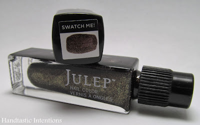
Today I have Julep: Candace to share with you! It was in my first (FREE+shipping) Julep Maven box that I posted about here. Candace is a brown-black based polish with gold glitter throughout. It looks more like a foil when it is applied on the nail. I was pretty excited about this because of all the gold glitter you can see from the bottle. The color I think is meant to be part of a fall collection. I am still acquainting myself with Julep, but I'm pretty sure this went out in the October boxes. Check out Candace:


This kind of reminds me of an olive color in some lights, but I am pretty sure it is supposed to be more brown-black. I was actually disappointed that the gold glitter really wasn't dominating in this polish. I would have liked it to be more gold. I'm not sure that I love this color so much anymore, but it went on smoothly like the other Julep I tried in this post. I only used two coats and it was like butter! Just maybe not my color. What do you think? Do you like these ambiguous multi-tonal polish colors? Thanks for reading, as always!

Sunday, October 20, 2013

Swatch and Review of Julep: Ciara (It Girl Starter Box)

Julep is a monthly subscription service which focuses mostly, but not entirely, on nail care and nail polish. They have this ongoing promo of getting a free first box, you just pay shipping ($3.99). There are a few different style profiles, you take a test and it classifies you as one type. You don't have to stick with that box if you don't like it, but it is meant to be a guide. I tested as an "It Girl" and got some pretty awesome colors. Turns out, you also get free shipping if you spend $10, so I added on another color polish and the oxygen treatment. I ended up getting Ciara, Candace, Josephine and Blakely as well as the Oxygen Nail Treatment for $11.98. When the polish retails for $14.99 each, that's not a bad deal! In addition they sent me a glass nail file, nail decals and some candy corn. I must say, the candy corn was a little random, but I appreciated the extra effort. The box normally is $19.99 each month and in signing up for the free box, you are signing up for the subscription. I'm not sure how easy it is to cancel, but I do know it is super easy to skip boxes. To become a Julep "maven"sign up here and use the promo code: FREEMAVEN. Now that I've explained Julep, let's get on to the polish! I tried out Ciara first, because it reminds me most of fall and it is a unique mixture of plum-purple with royal blue micro-glitters throughout. On the nail, it is difficult to discern what color it actually is because it shifts so much in the light. I wouldn't call it a duochrome, but it has an interesting parallel quality.

Here's the whole box:


Ciara:


They come with this cool little swatch sticker too:


I was surprised at how thick this polish was straight out of a brand new bottle. My second surprise was that it applied well despite the thickness. I only applied two coats and was amazed at how smooth and rich this color looked. The base color reminds me of a lot of colors I've seen before, but with the addition of the blue mico-glitter, it makes it a whole new polish. I was very pleasantly surprised by Julep and this polish. Let me know what you think!

Friday, October 18, 2013

Swatch and Review of Stardust Polish: Mr. Rabbit

This is my 50th blog post! Can you believe it?? It seems like I just started my blog, but somehow I managed to get to 50 posts already. I started back in June as an outlet and I am so happy to share my polish adventures with you! So, thank you readers! I am celebrating my 50th post with a polish I really love. Today I have Stardust Polish's Mr. Rabbit from her Alice in Wonderland collection. It has such a whimsical feel to it. It has a white base with many different glitters in different colors. You can take a look at the macro here:


So lovely, I just adore the way this looks. I used three coats, but could have used four. It does have a lot of glitter, so a good thick top coat helps to even that out, I always use Seche Vite. You can find Mr. Rabbit here, but it looks like Drema is working on a restock. Because it is an indie brand, restocks are like Black Friday on the web. Every one loves her polish, and they are all in high demand. I think I actually got the last Mr. Rabbit from the most recent restock. I highly recommend this brand and this color. Thanks for reading!

Thursday, October 17, 2013

Swatch and Review of Deborah Lippmann: Rolling in the Deep

Last week I had to take an emergency trip to Sephora (beauty emergency) and of course I had to check out the new nail polish offerings. I have never bought a Deborah Lippmann polish, but have been eying them for a while. Ever since she came out with a True Blood collection I have been curious, but the price point always steered me away. In my emergency visit to Sephora, the nice sales lady gave me a generous sample which made me ever so grateful and much more willing to purchase a $17 polish. Usually DL polishes are $19, so really you could say I am being thrifty...sort of. Anyway, here we have Rolling in the Deep, which is part of the 2013 Fall Collection. It is a beautiful inky navy blue with some subtle shimmer that you can see in the bottle. One of my biggest hang ups about buying this polish was trying to determine if I can see the shimmers on the nail or not. Let's see:


As you can see in some pictures, this really looks black rather than blue, but in most lighting it is a great navy blue. However, there are no shimmers to be found on the nail. The shimmer gets lost int he polish, which was a big disappointment for me. I did like the color alone, but I was feeling like I needed a little nail art, so I added some dots and zigzags with OPI's Designer De Better (Holiday 2011 Muppets Collection). Pretty simple, but it added some spice to the look. Overall the quality was amazing, I only used 2 coat here and I had no tackiness or balding issues whatsoever. The polish also seemed to dry quickly, and that is always a plus. I would recommend this polish, but I still have a little buyers remorse over the cost. What do you think? Worth the price, or get a more unique color for the cost? As always, thanks for reading!

Tuesday, October 15, 2013

Nail Art: A Random Sampling


 Hello all! I have a somewhat unusual post for you today. I have a few nail art designs I never shared with you on my blog, but I didn't think these deserved a post on their own, so I decided to lump three nail art designs into one post! If you haven't figured it out yet, I like to play with nail designs a lot. Often I feel like the design doesn't live up to my expectations so I'll leave it on for maybe a day an take if off. The next few designs were of that variety of nail art. The first was for #nailartsep on Instagram (@HandtasticIntentions) and the theme was football. My husband is a Niners fan and I automatically thought I could represent his team on my nails for a little while at least. I'm not a huge fan of football, but why not make my husband happy and do a little nail art in the process?


The next design was one of which I wished I had taken more pictures! I wanted to try a natural colored leopard print nail and I actually think it turned out pretty well. I used some simple dotting tools to achieve this look. Nude: Ruffian, Naked, Brown: OPI, Wooden Shoe Like to Know, Black: Ruffian, Ciré Noir, Top Coat: NYC, Matte Top Coat. Ruffian nail lacquer can be found at Birchbox which is exclusive to the site. I bought the classics set which came with a nude, black and red. Once I finished my design, I felt like I had to have a matte finish, and I really enjoyed the final look. Makes me wish I had a better matte top coat!


This last design is one I had originally planned on writing it's own post about, but I didn't really like this one as much as I thought I would. It was inspired by one of Miss Jen Fabulous' designs seen on her YouTube channel. Pretty easy to do if you have dotting tools and an interesting look. I might try this again with different and more contrasting colors. I used A England Tristam for the dark blue and OPI Thanks a Windmillion for the lighter blue.


This was a pretty random assortment of designs, but I hope you like them! Let me know if you want a tutorial on any of these!

Related Posts